SEO
Free SEO Analysis
SEO Services
Content Marketing Services
Local SEO
Link Building Services
Specialized SEO Services
PPC
REPUTATION MANAGEMENT
Free Reputation Management Analysis
Reputation Management Services
Review Management Services
Specialized Reputation Management Services
CEO Reputation Management
Brand Enhancement
Business and Directory Listings
Comprehensive Reputation Management Audit
SOCIAL MEDIA
Free Social Media Analysis
Specialized Social Services
WEB DEVELOPMENT
Free Website Analysis
Web Design Services
Mobile Development Services
Website Maintenance Services
Specialized Development Services
MARKETING AUTOMATION
Free Marketing Automation Analysis
Specialized Marketing Automation Services
Comprehensive Marketing Automation
INDUSTRIES
ABOUT DMA
Web Development
How to Create the Best Mobile Friendly Website Design + Examples!
Request a quote
Its Fast, Easy & Free
Executive Summary
- To attract new visitors and retain existing ones, your site has to mobile-friendly. If it isn’t, you’re going to find your Google rankings, traffic, and sales drop.
- If you want people to take action on your site, you need to have high-contrast calls to action that make it blatantly clear what you’re asking.
- Simple websites load faster and will get you higher conversion rates.
Mobile-friendly website design is a must for 2020. Mobile traffic accounts for more than half of web traffic worldwide, so it’s important to provide the best possible mobile browsing experience if you want to attract and keep site visitors.
In this article, we’re going to share 12 tips to create a mobile-friendly website design that you can use to keep mobile traffic and maybe even boost mobile conversions and sales.
What Is Mobile-Friendly Website Design?
Mobile-friendly website design is a design that works well on mobile devices. This could mean using:
Responsive Design:
Your website’s design adjusts to the screen size, no matter what device the visitor is using.
Dynamic Serving:
Visitors are shown a different version of the site, optimized for the device they’re visiting from.
Mobile App:
Visitors access your content through a mobile app.
Responsive design was all the rage a few years ago, but these days it’s the very least you can do to create a mobile-friendly website design. Many website designers are now focusing on a mobile-first model for building websites. Mobile-friendly is a nice midpoint between the two.
If you decide that creating a mobile app is best for your business, we can help you with iPhone app development or Android app development—just contact us for a quote.
Why Mobile-Friendly Website Design Matters
As of July 2019, Google moved to mobile-first indexing for all new websites. This means that Google predominantly uses the mobile version instead of the desktop version of the content for indexing and ranking.
To attract new visitors and retain existing ones, your site has to mobile-friendly. If it isn’t, you’re going to find your Google rankings, traffic, and sales drop.
In fact, 62% of visitors to your mobile store are less likely to purchase from you if they have a negative experience with your mobile store!
That’s a lot of sales to lose.
So, how do you make sure that you’re not losing sales because of a poor mobile experience?
Let’s dive into 12 tips you can use to create a mobile-friendly website design that wows visitors and wins more sales.
How to Create a Mobile-Friendly Website
The tactics included here start from the bare minimum you can do to create a mobile-friendly website using responsive design. But, we don’t stop there.
We share tips for every aspect of your site and content that will make your mobile visitors—and Google—take notice.
1. Use a Responsive Theme
Using a responsive theme is a quick fix that should be treated as the beginning of your mobile optimization efforts.
This tip works best for users who are just starting their business site or who have a low-traffic site. While a more established site can change themes, it might not be the best—or easiest—option.
After you’ve chosen a new, responsive theme you’ll want to test it on multiple devices to make sure that it looks good across devices and platforms (iOS vs. Android, for example).
2. Keep Navigation Simple
When you access a website from your mobile device, you have a lot less room to move around. This makes your mobile navigation a vital part of creating a mobile-friendly website design.
While your navigation menu on your desktop site can have tons of options that go several levels deep, you don’t want to do that for your mobile site.
It’s much better when your content fits on a single screen to keep visitors from needing to scroll or zoom to navigate your site.
WWF is a great example of how to do mobile navigation:
As you can see, when you click to bring up the navigation menu, you get a simple grid that requires zero scrolling.
Compare that to what their desktop site looks like from a mobile device:

Sure, everything is there for you to tap without scrolling, but you’re more likely to tap on a link you didn’t want because everything is so small. To make sure you didn’t tap on the wrong thing, you’d need to zoom in.
3. Use Short Forms
Forms on both desktop and mobile versions of your website should be short to keep visitors from abandoning your forms. However, short forms are an absolute must on your mobile site.
Really take a look at your forms and decide if you really need all of the information you’re asking for.
Most of the time, you really only need the name and email address; you can get the rest of the information from them later.
This applies to checkout pages and the information you collect in your checkout process, too.
When your checkout process is too long and requires shoppers to provide too much information, they’re going to leave without completing their purchase.
Forms should create as little friction as possible.
4. Include Strong Calls to Action
If you want people to take action on your site, you need to have high-contrast calls to action that make it blatantly clear what you’re asking.
Plus, you’re working with limited real estate. That means you’ll want to keep your calls to action limited to a single purpose.
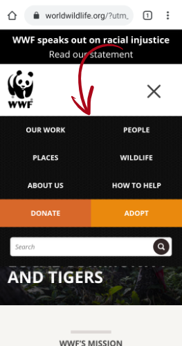
Let’s take another look at WWF’s mobile site.

That bit we circled is the call to action.
But, there are two options there! You told us to only use one call to action!
You’re right. It does look like there are two options. However, both options lead to WWF getting your money, either through a direct donation or through sales of WWF products.
Basically, WWF is using two ways of stating the same call to action.
Plus, notice how big, noticeable, and clickable each of those options is. No zooming needed, just tap on the one you want.
5. Add a Search Function
You may be worried that reducing your navigation menu down to just a handful of options is going to prevent users from finding what they’re looking for.
That’s why it’s a great idea to add a search function to your mobile-friendly website design.
The search bar should be at the top of the site and easy for users to access and find what they’re interested in.
6. Highlight Customer Service Options
There’s some basic information you need to include on your mobile-optimized website: phone number, email address, location (for brick-and-mortar businesses), and social media profiles.
The purpose of this is to help users get in contact with you if they’re having issues. This is a much better option than having them run into issues and leave your site because they can’t get the help they need.
And, they will need help. Regardless of how user-friendly your mobile website design is.
7. Use the Right Sizes
We’ve talked a little already about the importance of your call to action buttons being large enough that a user can tap without zooming in or risking hitting a link other than the one they were aiming for.
Remember, your mobile visitors are accessing your site from a 4”–6” screen and many smartphone users use their thumbs to tap on the screen.
Best practices for mobile-friendly website design suggest keeping your links within the “thumb zone.”
The thumb zone is the space on a mobile device’s screen that’s comfortable to reach with one’s thumb. Here’s what it looks like:
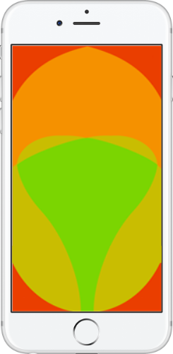
The green area in the center is where most people will be comfortable. As you move away from the lower center part of the phone’s screen, it gets increasingly difficult to use your thumb for navigation.
Keep this in mind when creating your mobile-friendly website design, placing your important elements and clickable buttons near the middle of the screen.
8. Don’t Use Popups
Don’t get us wrong, popups are a great feature of many lead generation software applications. But, if they’re not done well, they can really hurt the customer experience.
Since people use their thumbs to navigate and tap on the smaller screens that mobile devices have, popups can be very hard to close. Users might even accidentally click the popup when they’re actually trying to close it.
This could lead your visitors to leave your site because they’re having a hard time navigating to the things they’re interested in.
If you are going to use popups on mobile, you’ll need to use a popup maker that offers mobile-specific campaigns that are optimized for use on a smaller mobile screen. And, be sure to do tons of testing to make sure the user experience is one you would want for yourself.
9. Don’t Give Visitors a Wall of Text
Huge blocks of text are intimidating and really hard to read on many mobile devices. Keep your sentences and paragraphs short and pay attention to how much space your text is taking up on the screen.
Your goal is to make sure that your message comes through loud and clear. If your message is buried in 20 lines of text, there’s a good chance that nobody’s going to stick around for it.
Think about what you want your mobile visitors to do and what they want to do. Then, make it easy for those things to happen quickly and with as little text as possible.
10. Pick a Mobile-Friendly Font
Let’s face it, some fonts just aren’t great for mobile. The font you use on your mobile site needs to be easy to read.
You can also use variations in font formatting to differentiate content. For instance, using your standard font for the body text, but using bold or all caps for headlines.
Since you have a small space to work with, you need to make the most of it.
11. Improve Your Site Speed
If your site takes more than three seconds to load you’re going to lose more than half of your traffic.
Can you afford that?
To speed up your mobile-friendly website design, keep it simple.
This means getting rid of unnecessary images, GIFs, and other design elements.
Simple websites load faster and will get you higher conversion rates.
12. Start Using Accelerated Mobile Pages (AMP)
AMP still uses HTML but follows a specific format that makes them incredibly fast for mobile users. And, since this is a Google brainchild, these pages are going to get special treatment in search results on mobile devices.
Bear in mind that AMP might not be right for you. For starters, you’ll need to maintain two versions of your content. On WordPress, that’s easy thanks to the AMP plugin, but if you’re using a non-WordPress site, you’ll need to follow Google’s AMP tutorial.
5 Best Mobile-Friendly Website Design Examples
Now that you know what it takes to create a mobile-friendly website design, let’s take a look at five of the best mobile-friendly sites we’ve found to inspire you.
Tesla Motors

Why We Love It:
Tesla’s mobile site uses a font and font size that are easy to read and the buttons are sized and positioned well for thumb tapping. The images load fast and look good, even on a smaller screen.
Despite being informational and including images, the site doesn’t feel crowded.
And, the calls to action are obvious!
Bloomberg Business

Bloomberg’s mobile site sticks with a conventional black-and-white design that makes it show up crisp and clean on mobile devices. The font is simple and easy to read, with headlines, subheadings, and body content easily identified.
Bloomberg includes a minimal number of fast-loading images that add to the content.
Mailchimp

Mailchimp’s mobile site includes a nice flow and navigation. There’s a lot of text, but it’s broken up with fast-loading images and GIFs that make the site interesting to scroll through.
The navigation menu itself has just four options along with a search bar, so there’s plenty of space to get your thumb in there to tap on exactly which link you want.
Microsoft

Microsoft’s mobile website uses a flat design that it’s delightfully easy to navigate and scroll through. The images load fast and the fonts are nice to look at and easy to read.
Abduzeedo
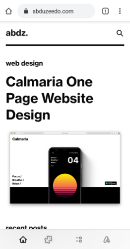
Abduzeedo’s site is beautiful in its simplicity. It uses a classic black-and-white color scheme which really makes the images pop. Plus, the navigation shows up at the bottom of the screen as icons, which makes navigation a breeze.
One of the things we love most about this mobile site is the font.
Conclusion
There’s a lot that goes into creating the best mobile-friendly website design you can. With so many moving pieces, there’s a lot that tends to get overlooked.
By using these tips for mobile-friendly website design, you can get it right the first time.
These days, it’s not enough to make your site responsive, it has to be built with mobile users in mind.
Your website is usually the first and only chance you have to make a good impression. Digital Marketing agency has been building websites for over 15 years and we’re certain we can help create a stunning mobile-friendly website design for you. Contact us for a free quote!
Our Sales team
We are available for you every time
